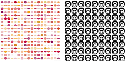
The charm of graphic design lies in its ability to convey a concept, an idea through a beautiful composition, layout and color to the people who see it. In fact, as long as we master some laws of graphic design and use it flexibly, we can also make wonderful designs.
Here we will introduce you to more than ten kinds of common design methods of graphic design.
(a), graphic design
The graphic design is to combine different basic graphics and form patterns on the plane according to certain rules. The boundary between the map and the ground is divided by the outline within the scope of the second dimension, and the image is depicted. The sense of three-dimensional space represented by graphic design is not a real three-dimensional space, but merely an illusion space formed by the visual guidance of human beings.
(b) Graphic design terminology:
1. Harmony: Understanding from a narrow sense, a harmonious graphic design is not monotonous or disorganized between unity and contrast. In a broad sense, when judging the relationship between two or more elements or parts and parts, the feeling and consciousness that each part gives us is an overall coordinated relationship.
2. Contrast: Also known as contrast, successfully arranging two elements with great contrasts in quality or quantity makes people feel strong and united, making the subject more vivid and the works more active.
3. Symmetry: Assume that a vertical line is set in the center of a figure, and the figure is divided into two equal parts. The figures of the left and right parts are completely equal. This is a symmetry chart.
4. Balance: Physically understood as referring to the relationship between weights, in graphic design, refers to the balance of visual effects based on the image's shape, size, weight, color, and texture.
5. Proportion: refers to the quantitative relationship between part and part, or part and whole. The proportion is an important factor that constitutes the size of all units in the design, as well as the arrangement of the units.
6. The center of gravity: The center of the picture is the center of gravity of the visual, the change of the outline of the picture image, the dispersion of the figure, the distribution of the color or light and shade can all affect the visual center.
7. Rhythm: The rhythm, which has a sense of time, is used to refer to the sense of motion that results when a constituent design repeats continuously with the same element.
8. Rhythm: The simple combination of elements in the plane structure is easy to monotonously repeat, and is arranged by changing the image or color group in a ratio or ratio, so that it produces a musical melody and becomes rhythm.
(III) Elements of Graphic Design
1. Conceptual elements, the so-called conceptual elements are those things that are not actually present and are not visible but that people's consciousness can feel. For example, we see the sharp corners of the figure, feel a bit above it, and there are edge lines on the outline of the object. Conceptual elements include: points, lines, faces.
2. The visual element: The concept element is not embodied in the actual design, it will be meaningless. Conceptual elements are usually represented by visual elements that include the size, shape, color, etc. of the graphic.
3. Relational elements: How the visual elements are organized and arranged on the screen depends on the relationship elements. Including: direction, position, space, center of gravity, etc.
4. Practical elements: Refers to the meaning, content, purpose, and function of the design.
Here we specifically introduce the composition of the graphic design.
Second, the use of elements
(a) The composition of points, lines, and surfaces
The image is the external feature of the object and is visible. The image includes all parts of the visual element. All the concept elements such as dots, lines, and faces also have their own images when they are seen on the screen.
The basic form in graphic design: In graphic design, a group of identical or similar figures is composed, each of its constituent units becomes a basic form, and the basic form is a minimum unit. It can be used to arrange and combine according to a certain structural principle. Good makeup effect.
1. Formation: In the composition, due to the basic combination, a combination of shape and shape arises. These relationships are:
2. Separation: There is a certain distance between the shape and shape without contact.
3. Contact: The edge between the shape and the shape is exactly tangent.
4. Overlapping: The relationship between shape and shape is a complex relationship, which results in a spatial relationship between up, down, left and right.
5 Overlapping: The transparency between shapes and shapes overlaps, but it does not create a spatial relationship between up and down.
6. Combination: The combination of shape and shape becomes a new, larger shape.
7. Subtraction: mutual coverage between form and shape, where the coverage is cut off.
8. Poor stacking: Forms and shapes overlap each other, creating new shapes in overlapping places.
9. Coincidence: The shapes and shapes overlap and become one.
Point effect to enjoy:

Line effect appreciation:

Face effect to enjoy:

(to be continued)
Office Sofa,Office Furniture,Leisure Sofa
Yongye Furniture Co., Ltd. , http://www.yongyechair.com